If you’re anything like the team at Tayloe/Gray, then you’ve been counting down the days to Stranger Things 4: Part 2 since binging Part 1 over a month ago (I know! How could they make us wait so long?!). So, in honor of today’s highly-anticipated premiere we thought we’d have a little bit of font fun. Don’t worry–no spoilers ahead!
Since those big red letters first hit our TV screens in 2016, the incredible Stranger Things title sequence has become iconic. You don’t have to be a designer to appreciate the instant nostalgia one feels as the outlined typographical treatment is slowly revealed over the retro-synth theme music. Like the characters in the show, the letters slowly come together, merging into a title befitting of a true 80’s horror classic.
Design studio and creative agency Imaginary Forces along with Stranger Things creators, the Duffer Brothers, went through dozens of fonts before landing on ITC Benguiat–created by the legendary typographer Ed Benguiat in 1977. Ultimately, the decision came down to how the font was able to evoke the titles that graced the covers of Stephen King’s classic horror novels of the same era in which the show would take place.
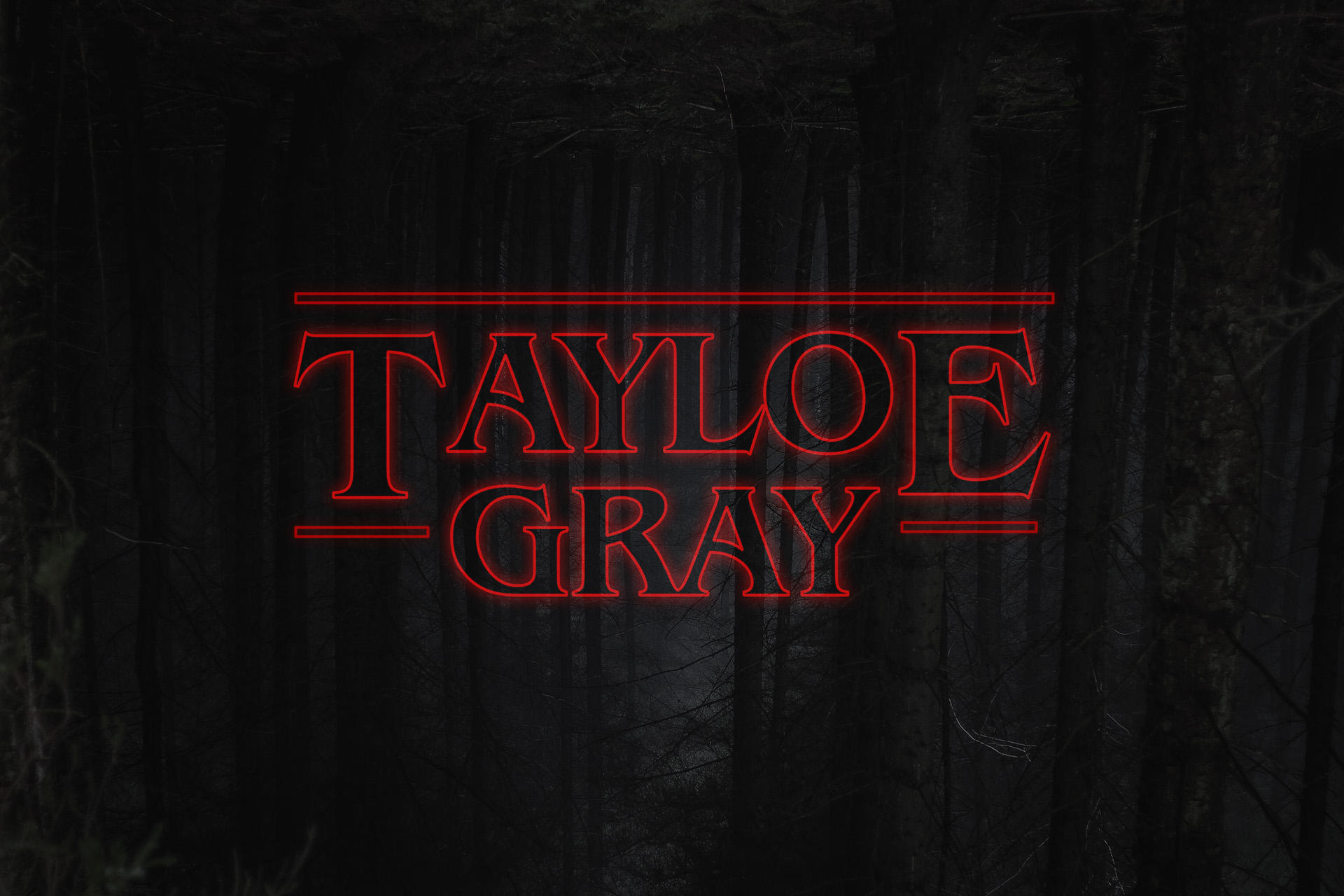
Want to Strangify your name or brand like we did? While we created our own using the ITC Benguiat font, some effects magic, and a photo of some creepy woods (upside down of course), there are some fun generators out there to help you achieve a similar look, like this one from Nelson Cash.
Need help creating your own iconic look and feel? Let our creative experts get you out of the upside-down with a logo and brand that attracts your ideal customers — contact us today!
Dedicated to Chase and other unfortunate souls who don’t know what they’re missing.